Tek-Tips is the largest IT community on the Internet today!

Members share and learn making Tek-Tips Forums the best source of peer-reviewed technical information on the Internet!

  • Congratulations SkipVought on being selected by the Tek-Tips community for having the most helpful posts in the forums last week. Way to Go!

Pie Chart with linked updatable data table formatting 1

Status
Not open for further replies.

sxschech

Technical User
Jul 11, 2002
1,032
0
36
US
Was asked to take over maintaining a data pie chart. In the upper right hand corner is a table, currently, it appears to be a text box in which one has to manually click on it and key in the data. As I would prefer not to have to rekey in data that already exists in the spreadsheet, decided to delete the text box and recreate the look using the camera tool unless there is another suggestion. Trying to fine tune it. The chart background is set to gradient, so in order to match with the chart, I have chosen no fill. Text is white so the source range I can no longer see since both text and cells are white. How could I display the text for editing while keeping it white on the chart or would I have to manually change the color of the text when editing and then change it back when done? I would also like to hide the gridline, however from what I read the options are to remove gridlines from entire sheet, which I'd rather not do or change the color of the gridlines to match the color of the chart, which isn't quite possible due to it being a gradient. Another issue, the original text box appears to be contained within the chart while the one I created with the camera tool is on top of the chart, so when I move the chart, the image does not move, can the image be placed in the chart or moved positionally when the chart moves?

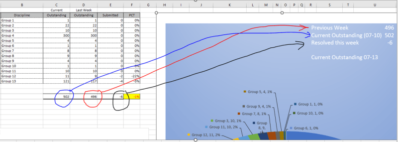
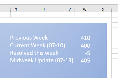
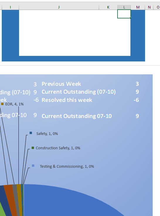
Since currently we can't see the text or gridlines, I have put a blue border around the range that is being displayed on the chart as shown in the partial screen shot.

PieChartTable_ivsi63.png
 
Hi,

In the upper right hand corner is a table, currently, it appears to be a text box in which one has to manually click on it and key in the data.

Is it a TABLE or is it a TEXTBOX?

If it's a TEXTBOX, I'd replace it with a Data Validation Drop Down Selector.

Don't know why you would use the Camera Tool, as it is only a Display Feature and not suitable for data entry/selection.

How could I display the text for editing while keeping it white on the chart or would I have to manually change the color of the text when editing and then change it back when done?

Use a Data Validation In-Cell Drop Down. The selection drop down values will be visible when you select the drip down button, but the selection can have the background color.


Skip,
[sub]
[glasses]Just traded in my OLD subtlety...
for a NUance![tongue][/sub]
"The most incomprehensible thing about the universe is that it is comprehensible" A. Einstein

You Matter...
unless you multiply yourself by the speed of light squared, then...
You Energy!
 
Is it a TABLE or is it a TEXTBOX?
It is a text box.


I'm not sure if I understand your recommendation as I don't see how a drop down data validation applies to what I'm doing, which means I probably didn't explain things well. (maybe still haven't, but have a read anyway if you like)

I'm not doing data entry, edit in the traditional sense, instead, the values will change each week when the detail data gets updated via copy and paste from a third party file. I am using the camera tool so that I can display the data needed from the cells along with concatenation to show the date as MM-DD and formula to subtract one number from another to get the difference <Resolved This Week>.

What I meant by edit is if in the future the description of the text is requested to read differently. Maybe they want it to say <Completed> rather than <Resolved>.
 
What I meant by edit is if in the future the description of the text is requested to read differently. Maybe they want it to say <Completed> rather than <Resolved>.

A TEXTBOX is something that you ENTER data into.

If you're SELECTING rather than ENTERING data, there's usually a LIST to select from that can be the reference source for a Drop Down, so the user can SELECT either Completed or Resolved or whatever you please. That is the function of a Data Validation Dropdown Box. It is a feature of Data > Validation in the Ribbon.

Skip,
[sub]
[glasses]Just traded in my OLD subtlety...
for a NUance![tongue][/sub]
"The most incomprehensible thing about the universe is that it is comprehensible" A. Einstein

You Matter...
unless you multiply yourself by the speed of light squared, then...
You Energy!
 
Maybe if I zoom out a bit with this image, it will give you a better idea. Simply wanting to display the values of the items circled on the chart. No user intervention. Reason for displaying on the chart is that the chart will be printed out as a stand alone pdf, so the data from cols B-F are not included in the final output.

Anyway, since was able to get 90% there format wise by using the camera tool, will leave it at that. I do have a conditional format question if you are willing to consider that and if so should I post in this thread since it is part of what is being displayed on this chart or create a new thread?

PieChartTable1_fbc2tp.png
 
Simply wanting to display the values of the items circled on the chart. No user intervention.

U4: =D18

...gets you the first value in your Blue Chart area. A simple reference, in a cell formatted in any way you like. I counted rows best I could.

But you mentioned Conditional Formatting. That could be done in the blue portion if you use a reference or in the picture source if you use the Camera Feature.

Skip,
[sub]
[glasses]Just traded in my OLD subtlety...
for a NUance![tongue][/sub]
"The most incomprehensible thing about the universe is that it is comprehensible" A. Einstein

You Matter...
unless you multiply yourself by the speed of light squared, then...
You Energy!
 
In reply to your original post ('How could I display the text for editing while keeping it white on the chart or would I have to manually change the color of the text when editing and then change it back when done?'):
1. insert a textbox (shapes) in the chart,
2. when the textbox is selected, in the formula bar start with '=' and point to source cell (D18). Accept, you should see external reference '=SheetName!$D$18'.
3. change number format of the source cell, you should see the same text in the textbox,
4. format selected texbox, can be done in home tab (as font name and size), shape format tab and shape format pane.

And no, there is no conditional formatting. You need camera tool for this. When I use camera tool, the source data is in separate hidden or very hidden worksheet, excel still properly displays the image of range.

combo
 
Since combo has confirmed that to use conditional formatting, the camera tool is what is called for.

My reason for using conditional formatting is due to them wanting to show a midweek update and based on that the logic would be if <quote>today</quote> is between Monday and Wednesday, hide the data, if date is between Thursday and Sunday, show the data.

I found this formula to display one set of calcs from Monday through Wednesday and the other set of calcs for the rest of the week. Thought this might be a starting point to apply to the conditional format.

=IF(WEEKDAY(TODAY())<5,AA7-AA8,AA7-AA11)

Since the text is white and background is gradient, I can't use white or blue in the conditional formatting to hide the data. I read that there is a format using ;;; which can hide the text, how would that be incorporated into the conditional format? I haven't done much with the conditional format capabilities so that is why reaching out on how best to set up.

In the image, Top one is how it should look between Monday and Wednesday, Bottom is how it should look between Thursday and Sunday.

Alternatively, is it possible to have the camera range adjust based on the date, then don't have to worry about hiding or unhiding, etc.?

X7:Y9 Monday through Wed
and
X7:Y11 Thur through Sun

PieChartTable2_jyygzh.png
 
Linked texbox shows text displayed in cell. So a simple way to hide something is to use IF formula in cell: =IF(condition to hide contents,"",value to display if opposite).
The camera tool is necessary if you need to change format conditionally.

combo
 
The if statement looks like a simple solution...

Unfortunately, things have not gone well and I am probably going to give up. I thought I had things under control, but not really.

I can't believe how much time and effort I've been putting in and trying to get things right.

I am unable to change the text in the source data for the header without losing all the data labels numbers and call outs.
Unable to print the pie chart and show the data from the camera tool. (I assume because not part of the chart?)

Unable to make any data modifications to the chart. Not sure how that happened. Before, when clicking on the pie chart, the ribbon brought up menu item titled PivotChart Analyze, which is where I click the refresh button. This is no longer visible/available, so can't refresh the chart.

I would like to attach a copy of the file to see if someone can see what I'm doing wrong, but once I change the data so it would be generic, I lost the PivotChart Analyze, so chart is no longer updateable.

Maybe things will go better tomorrow, otherwise, I'll stick with the bad headers and revert to manually updating the text box <sad face icon etc.>
 
Pivot chart is linked with pivot table, is the pivot table still in the workbook?

combo
 
To answer your question (yes and no), yes in original file and apparently not in file I modified, see below for discovery.

Ok, I copied a previous file and was able to modify with generic data, attached.

I had thought the pivot chart is not based on a pivot table for two reasons:

1) I provided the original data in an already summarized format as an export/copy paste from an access query and assumed the user based the chart on that range which seemed to be confirmed by...
2) When I click on the chart, PivotChart Analyze, Change Data Source, it shows the table range of B2:F15, which is pointing to the data I originally provided

However, yesterday, when playing with the chart and getting rid of what I thought was extraneous data on the sheet, I did discover that there was a data table "hidden" behind the actual chart and had deleted it (J18:K33). That must have been the cause of the PivotChart Analyze menu no longer being available. Does this mean that the chart is using multiple data sources?

How can I change the titles (without losing the data labels on the chart) on the tables so that C2 displays CurrentWeek and D2 displays PreviousWeek instead of Outstanding in both cols? Then can get rid of the first row.
 
 https://files.engineering.com/getfile.aspx?folder=caa7057f-88e2-4fa5-a0d0-afdb36e312b5&file=20230710_OverdueTekTipsCopy.xlsx
Thanks again combo for your formula suggestion with [tt]if and ""[/tt] to avoid conditional formatting and for checking to see if there was a pivot table.

I added two formula cells one for the text and the other for the numbers with concatenation and then placed two textboxes within the chart and so far looks ok.

[tt]=TEXTJOIN(CHAR(10),TRUE,Summary!B42:B46)
=TEXTJOIN(CHAR(10),TRUE,Summary!B42:B46)[/tt]

Textboxes
[tt]=Summary!$B$49
=Summary!$B$50[/tt]

I assume need two boxes due to wanting the text to be left aligned and the numbers right aligned or could it all have been in one text box?

PieChartTable3_derb0m.png
 
Textbox has text alignment set for the whole text, so the layout as above requires two textboxes in each line.

combo
 
Thanks for confirmation. One would be nice, but at least two boxes is much better than dealing with 8 individual boxes.

Any thoughts on how I can change the header text of the table in cells [tt]C2[/tt] and [tt]D2[/tt] without losing the data labels on the pie chart?
 
I'm out of Excel at this moment, what happens when you change the name in pivot table (just overwrite the cell in pivot table)?

combo
 
Tried that, no luck. I did see that it changed the title in the values section, but once I hit refresh, then the original title goes away the chart goes blank and then when I click on the field, chart reappears without any data labels.
 
Renaming column in pivot table data source destroys the pivot table, so you need to re-create it and customize pivot chart.

combo
 
Status
Not open for further replies.

Part and Inventory Search

Sponsor

Back
Top