Tek-Tips is the largest IT community on the Internet today!

Members share and learn making Tek-Tips Forums the best source of peer-reviewed technical information on the Internet!

  • Congratulations Mike Lewis on being selected by the Tek-Tips community for having the most helpful posts in the forums last week. Way to Go!

Windows 10 and VFP EXE

Status
Not open for further replies.

memarques

IS-IT--Management
Aug 28, 2000
22
BR
Hi there.

When I run a VFP program in Windows 10 it shows a “white” line in top of the application´s window. I think this is ugly. This, of course, is not a problem at all.

But, is there a way to strip this? (Thought windows 10 configuration or in VFP?).
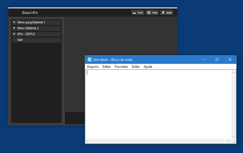
30-03-2016_10-51-40_bf9s73.png

Thanks, regards
Mauro
 
>The question is how to hide that line.
The best you may be able to do is get that line black.

And the easiest is to go the full mile and do the resizing yourself. You also must have code for dragging the window at your own titlebar. So you know how to react to mouse events.

Bye, Olaf.
 
Hi memarques,

i say that this behavior is a bug of Windows 10 !!!

I suggest to wait if one of the next updates to windows 10 will improve this behavior.

(for info: the version of my windows 10 is 1511 (Build 10586.164) and shows also the same bug)

Best regards, Stefan
 
Well,

I wouldn't go as far as calling that a bug, as this residual line is only there in resizable forms it seem to be there by design to signal the resizability, probably. It's a bad UX design, as you can't resize a form at that line (well, not only at that line, the main hotspot for form resizing still rather is the bottom right corner, secondly any corner, thirdly some border and lastly the top border). So the visual hint for a resizable form should rather only be done by a resize corner, but I wouldn't wait for this to change automatically.

If you want to shout out at MS, first calm a bit down and call it connect to MS, then there is
Don't report this as VFP bug, though, it's not different, if you create a resizable window with no titlebar from any other tool. Well, VFP isn't in the list of products anyway. The white line somehow falls into the category "Design and User Experience", but there are no products associated to that. Also Winforms is no product in itself, rather (still) a base technology of windows desktop UI/UX.

From the other point of view, you might find a reasoning for this in documents about Windows UX Design principles. A non standard/themed form alone is breaking the UX guidelines, so also avoid to report the problem with your skinned form screenshot, rather show a plain vanilla resizable black canvas form without titlebar and it'll become obvious why the white line is disturbing for such a dark form, no matter if this is taken further from a current Windows desktop theme or not.

Bye, Olaf.
 
Ok.

Thanks a lot everyone for this discussion.

Like I said this is not a "problem" at all (just ugly in my opinion), so I'll decide if I let this like it is now, or change for a fixed border with a particular “resize” procedure in this form. I'll check what will happen with new Windows 10 versions (probably it will not change).

I agree with Olaf, that this is not a bug, but a bad decision on windows 10. I imagine that there is a reason for this, who knows?

Regards
Mauro
 
It might or might not be a bad decision. There might or might not be a reason for it. But, for better or worse, it is the status quo - the normal appearance of a resizable window that users will come to expect. That alone is a reason for leaving it as it is.

Mike

__________________________________
Mike Lewis (Edinburgh, Scotland)

Visual FoxPro articles, tips and downloads
 
Well, I don't think the usual user expects that, or recognizes it as a resizable form. That's what makes it a bad design decision.

As far as I like some of the minimalistic design MS does in Windows 10, this still is a design trend having become a bit too obscure. If you look at flat styling chronological I think it was first in the web - comapanies deciding for a flat and simple icon - even recognizable as favicon (I don't dare to think this is the reason for flat design). Then Apple applied it in iOS7 and then - again last - it moved into Windows. Win 8/8.1 already went that direction from Win7 in some aspects, mainly in the tiles/modern UI start screen section, obviously.

If you like, take the view of a web designer: Also view the story of flat vs realism: - it shows the flattening of the company/product icons I talked about.

Once we're all flattened by MS, Apple and Google, I bet they'll go back to realism in a new form of 3D experience. Who knows where this all is leading.

Bye, Olaf.
 
Status
Not open for further replies.

Part and Inventory Search

Sponsor

Back
Top