SitesMasstec
Programmer
Hello colleagues!
My webpage displays fine in desktop, tablet and smartphone screens.
Some days ago Google Search Console warned me about Mobile Usability problem:
"Visibility window is not defined"
So, I put the HTML the following meta tag in the HEAD section:
And the problem with that error ("Visibility window is not defined") at the Google Search Console was solved.
But a worse problem arose, as I have in my webpage the code:
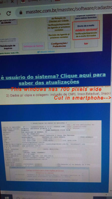
The browser in a smartphone to display 700 pixels wide (width="700") in the defined window for the content of avisocadascadupg.htm takes half the screen, another half is cut!
And some other contents of the page are also cut!
Thank you,
SitesMasstec
My webpage displays fine in desktop, tablet and smartphone screens.
Some days ago Google Search Console warned me about Mobile Usability problem:
"Visibility window is not defined"
So, I put the HTML the following meta tag in the HEAD section:
Code:
<meta name="viewport" content="width=device-width, initial-scale=1.0">And the problem with that error ("Visibility window is not defined") at the Google Search Console was solved.
But a worse problem arose, as I have in my webpage the code:
Code:
<iframe style="border:none" src="avisocadascadupg.htm" height="120" width="700"></iframe>The browser in a smartphone to display 700 pixels wide (width="700") in the defined window for the content of avisocadascadupg.htm takes half the screen, another half is cut!
And some other contents of the page are also cut!
Thank you,
SitesMasstec