Tek-Tips is the largest IT community on the Internet today!

Members share and learn making Tek-Tips Forums the best source of peer-reviewed technical information on the Internet!

  • Congratulations Chris Miller on being selected by the Tek-Tips community for having the most helpful posts in the forums last week. Way to Go!

Excel Stack Graph 3

Status
Not open for further replies.

laurr

Technical User
May 22, 2022
4
US
Hi Team

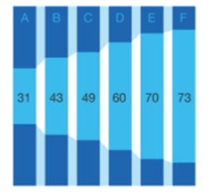
Hope all is well. I am trying to recreate a graph I saw online> Please see picture
BAR_GRAPH_mvgelx.png


It looks like a funnel or a stacked graph but I am unable to re-create. Any ideas on what type of graph it is? And how to re-create it in excel

Thanks for the advice in advance
 
Hi,

I am trying to recreate a graph…

Exactly what did you try, in Excel, I assume.

Skip,
[sub]
[glasses]Just traded in my OLD subtlety...
for a NUance![tongue][/sub]
"The most incomprehensible thing about the universe is that it is comprehensible" A. Einstein

You Matter...
unless you multiply yourself by the speed of light squared, then...
You Energy!
 
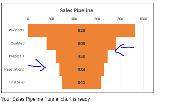
I tried the funnel graph in excel. Flipping it on it's side but I don't know how to fill in the white space with an alternate color in excel
funnel_grwznn.png


I also tried a stacked graph but I don't know make the bar close together.

To me it looks like a funnel graph.
 
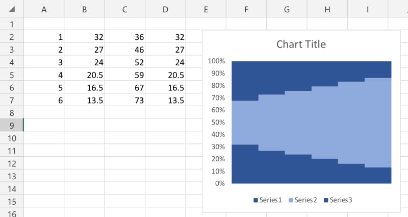
This is a stacked percent chart

CBA1E4F8-CC5B-4227-8C8D-98406660DD79_xbizoq.jpg


0% Gap

Skip,
[sub]
[glasses]Just traded in my OLD subtlety...
for a NUance![tongue][/sub]
"The most incomprehensible thing about the universe is that it is comprehensible" A. Einstein

You Matter...
unless you multiply yourself by the speed of light squared, then...
You Energy!
 
You got closer than I did. How did you create it? Can you explain what you did?
 
I'd imagine the key column here is C, with B and D being calculated (well, either B or D being calculated, and then the other having the same value). That's certainly how I'd do it (but I'fd have to then use a stacked column chart, as I don't have access to funnel charts in my version of Excel)
 
The data:
[tt]
Column 1: the stack number
Column 2: =(100 - col3)/2
Column 3: the % value of that stack
Column 4: = col2
[/tt]

The chart:
100% Stacked Column
Your column 3 values need to be from 0 to 100, representing percentages.

Once your 100% Stacked Chart is selected, right-click any series in the chart and select Format Series.

In Series Options,
set the Gap Width to 0%.
set the Fill to the color or gradient you desire for each of the three Data Points.


Skip,
[sub]
[glasses]Just traded in my OLD subtlety...
for a NUance![tongue][/sub]
"The most incomprehensible thing about the universe is that it is comprehensible" A. Einstein

You Matter...
unless you multiply yourself by the speed of light squared, then...
You Energy!
 
You can also add Data Point Values to the middle series.

Skip,
[sub]
[glasses]Just traded in my OLD subtlety...
for a NUance![tongue][/sub]
"The most incomprehensible thing about the universe is that it is comprehensible" A. Einstein

You Matter...
unless you multiply yourself by the speed of light squared, then...
You Energy!
 
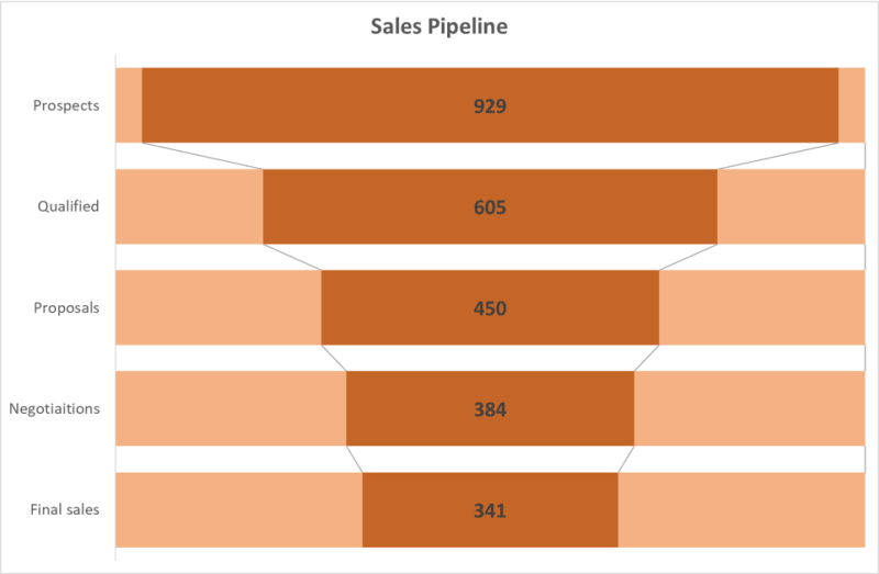
With gap<100% you can also add lines between categories. As your chart has all necessary data, I would remove x-axis and grid lines (both options can be easily accessed either from layout in chart design tab or selection in format tab). After this:
SalesPipeline_boxr5g.png


combo
 
So glad you found something that helped you solve your problem.

Can you tell us what you found most helpful and why?

This focused reply will help other members searching for help.

Skip,
[sub]
[glasses]Just traded in my OLD subtlety...
for a NUance![tongue][/sub]
"The most incomprehensible thing about the universe is that it is comprehensible" A. Einstein

You Matter...
unless you multiply yourself by the speed of light squared, then...
You Energy!
 
Status
Not open for further replies.

Part and Inventory Search

Sponsor

Back
Top