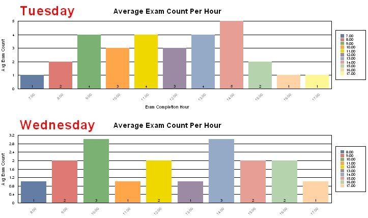
I keep running into this problem and finally want to get it sorted out. I am creating a chart which shows average exam volume/counts per hour. For example, I will chart out Weekday hourly averages spanning over a month's time. For Tuesday there will be data/bars for only those hours which had activity. This can be confusing when you compare this to Wednesday which could have different hours of activity. This of course throws off the color scheme of each bar. Ideally I want a spot for each hour (whether it is 12am to 11pm or 9-5). This would fix both the color scheme and place an equal spacing to the charts for quick review.
Thanks for any help!
Joe
Thanks for any help!
Joe