notsoevilgenius
MIS
I have a friend that has a site on Shopify with is enough of a pain in the ass.
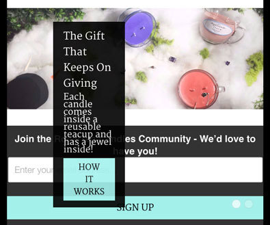
This is what she has now...
This is what she wants it to look closer to...

She kept telling me she wanted the flexslider on the page to only show part of the image when displayed in portrait on a smartphone, but after a couple of conversations what she really wants is the caption box on top of the flexslider to fit better on the mobile portrait page.
Index page html
device and mobile css
So really want I'm looking for is which line in the html tells me which css element I should find to edit. flex-caption? container? columns? And suggestions for the changes.
Thanks
This is what she has now...
This is what she wants it to look closer to...
She kept telling me she wanted the flexslider on the page to only show part of the image when displayed in portrait on a smartphone, but after a couple of conversations what she really wants is the caption box on top of the flexslider to fit better on the mobile portrait page.
Index page html
Code:
  <div id="homepage_slider" class="flexslider">
    <ul class="slides">
      {% if settings.video_position == '1' %}{{ video_slide }}{% endif %}
      {% if settings.slideshow_1_enabled %}
	    	<li>
	    		<a href="{{ settings.image_1_link }}"><img src="{{ 'slideshow_1.jpg' | asset_url }}" alt="{{ settings.image_1_alt_text | escape }}"  /></a>
	    		{% if settings.image_1_headline != blank or settings.image_1_subtitle != blank or settings.image_1_button_text != blank %}
	    		  <div class="flex-caption">
              <div class="container">
                <div class="columns {% if settings.image_1_text_align == 'left' %} align_left sixteen {% elsif settings.image_1_text_align == 'right' %} align_left seven offset-by-nine {% else %} sixteen {% endif %}">
                  <div style = "background-color:#000000; opacity:0.9; padding:10px 15px 10px 15px; max-width:20vw; min-height:150px; margin-left:10%; margin-top:.005%;"> <!--KELUBBERS-->
                  <h1 class="headline" style="color:{{settings.image_1_text_color}}">{{ settings.image_1_headline }}</h1>


                  <p class="subtitle" style="color:{{settings.image_1_text_color}}">{{ settings.image_1_subtitle }}</p>

                  {% if settings.image_1_button_text != blank %}
                    <a href="{{ settings.image_1_link }}" class="action_button">


                      {{ settings.image_1_button_text }}


                    </a>


                  </div>
device and mobile css
Code:
/* Tablet Portrait size to standard 960 (devices and browsers) */
  @media only screen and (min-width: 768px) and (max-width: 959px) {
    .nav ul li { padding: 0 0 0 10px; }
    .flex-caption { top: 0; }
    input.search_box { width: inherit !important;}
  }
/* All Mobile Sizes (devices and browser) */
  @media only screen and (max-width: 767px) {
    .collection_menu { display: none; }
    .container div.tag_filter { display: block; }
    #tag_filter, #sort-by {
      margin: 1.5em 0 0.5em 0;
    }
    .blog_filter {
      display: block !important;
      width: 100%;
    }
    .blog h2 { margin-top: 1.5em }
    .section_select { text-align: center; }
    .or {
      text-align: center;
      width: 100%;
      display: inline-block;
      padding-left: 0;
      padding-bottom: 5px;
    }
    .toggle span {
      display: block;
    }
    .toggle_list {
      display: none;
    }
    select {
      width:100%;
    }
    input.contact_email {
      width: 94%;
    }
    .search_page_text {
      text-align: left;
    }
    a.button,
    button,
    .action_button,
    a.action_button,
    textarea {
      width: 85%;
    }

    .flexslider a.action_button {
      width: initial;
    }

    input[type="submit"],
    input[type="reset"],
    input[type="button"],
    input.action_button[type="submit"],
    input.action_button[type="button"],
    .sign_up {
      margin-left: 0 !important;
      width: 100%;
    }

    .cart_icons {
      display: none;
    }
    .credits_right {
      text-align: left;
    }
    .container .column.thumbnail, .container .columns.thumbnail {
      margin-top: 1em;
    }
  .title_column {
      float:left;
    }
  .subtotal_amount {
      text-align:right;
    }
  .mobile_left {
      text-align:left;
    }
  .container div.mobile_only {
      display:block;
    }
  .quantity_label {
    display: inline;
  }
  .price_total {
    text-align: right;
  }
  .price_total_text {
    display:block;
  }
  .update_subtotal, .price_total, .remove_column, .checkout_table_header {
      display: none;
    }
  .mobile_right {
      text-align: right;
    }
  .quick_shop {
      display: none !important;
    }
  .cart_price {
    display: block;
    margin-bottom: 0;
  }
  table tr th, table tr td {
      padding: 2px;
    }
  input.action_button {
      margin-bottom: 1em !important;
    }
  .multiple_product_images {
      display: none;
    }
  .flex-caption {
    top: 0;
  }
  .flex-caption .headline {
    font-size: 1.5em;
    line-height: 1.5em;
  }
  .flex-caption p.subtitle {
    font-size: 1.1em;
    line-height: 1.1em;
  }
  .container .blog_content {
    padding-left: 0;
    border: 0;
  }
}
/* Mobile Landscape Size to Tablet Portrait (devices and browsers) */
  @media only screen and (min-width: 480px) and (max-width: 767px) {
    .mobile_hidden { display: none !important }
    ul.menu li.navicon_button { display:inline-block }
    ul.menu li { padding: 0 0 0 10px; }
    ul.nav_buttons { position: relative; top: 10px }
  }
/* Mobile Portrait Size to Mobile Landscape Size (devices and browsers) */
  @media only screen and (max-width: 479px) {
    .mobile_hidden { display: none !important }
    ul.menu li.navicon_button { display:inline-block; }
    ul.menu li a.cart { padding-left: 25px; }
    ul.menu li a.navicon { padding-left: 28px; }
    ul.menu li { padding: 0 }
    ul.nav_buttons { position: relative; top: 10px; text-indent: -1000em; text-align: left }
    .cart_count { display: none;}
    input.search_box { width: 240px !important;}
    .flex-caption .headline, .flex-caption p.subtitle{
        font-size: 1.1em;
        font-height: 1.1em;
      }
    .flex-caption p.subtitle {
      font-size: 0.9em;
      line-height: 0.9em;
      margin-bottom: 0.5em;
    }
    .flex-caption .action_button {
      padding: 4px 15px;
      font-size: 12px;
    }
    .flex-direction-nav .flex-prev {display: none;}
    .flex-direction-nav .flex-next {display: none;}

    h1, h2, h1.home, h1.blog_title, h3, h4, h5, h6, .title a {
        font-size: 150%;
      }
    h1, h1.home, h1.blog_title, .title a, h2 {
        padding:0;
      }
}
@media
  (min--moz-device-pixel-ratio: 2),
  (-o-min-device-pixel-ratio: 2/1),
  (-webkit-min-device-pixel-ratio: 2),
  (min-device-pixel-ratio: 2) {
    ul.menu li a.navicon {
      {% if settings.cart_icon == 'light' %}
        background-image: url({{ 'menu2x.png' | asset_url }});
      {% else %}
        background-image: url({{ 'menu_dark2x.png' | asset_url }});
      {% endif %}
      background-size: 20px 119px;
    }
    input.search_box {
      background: #fff url({{ 'search2x.jpg' | asset_url }}) no-repeat 6px;
      background-size: 14px 14px;
    }
    .nav ul li a.cart {
      {% if settings.cart_icon == 'light' %}
        background-image: url({{ 'cart2x.png' | asset_url }});
      {% else %}
        background-image: url({{ 'cart_dark2x.png' | asset_url }});
      {% endif %}
      background-size: 16px 64px;
    }
}

@-moz-document url-prefix() {
  input.search_box {
    position: relative;
    top: 8px;
  }
}

@media only screen and (min-device-width : 320px) and (max-device-width : 1024px) {
     html {
        -webkit-text-size-adjust: 100%;
     }
}
So really want I'm looking for is which line in the html tells me which css element I should find to edit. flex-caption? container? columns? And suggestions for the changes.
Thanks